Design
Simple is back, in a massive way
'Simple' isn't very simple at all. Here, we look at the simplicity in product design that comes from solving complexity.
Aceptamos:
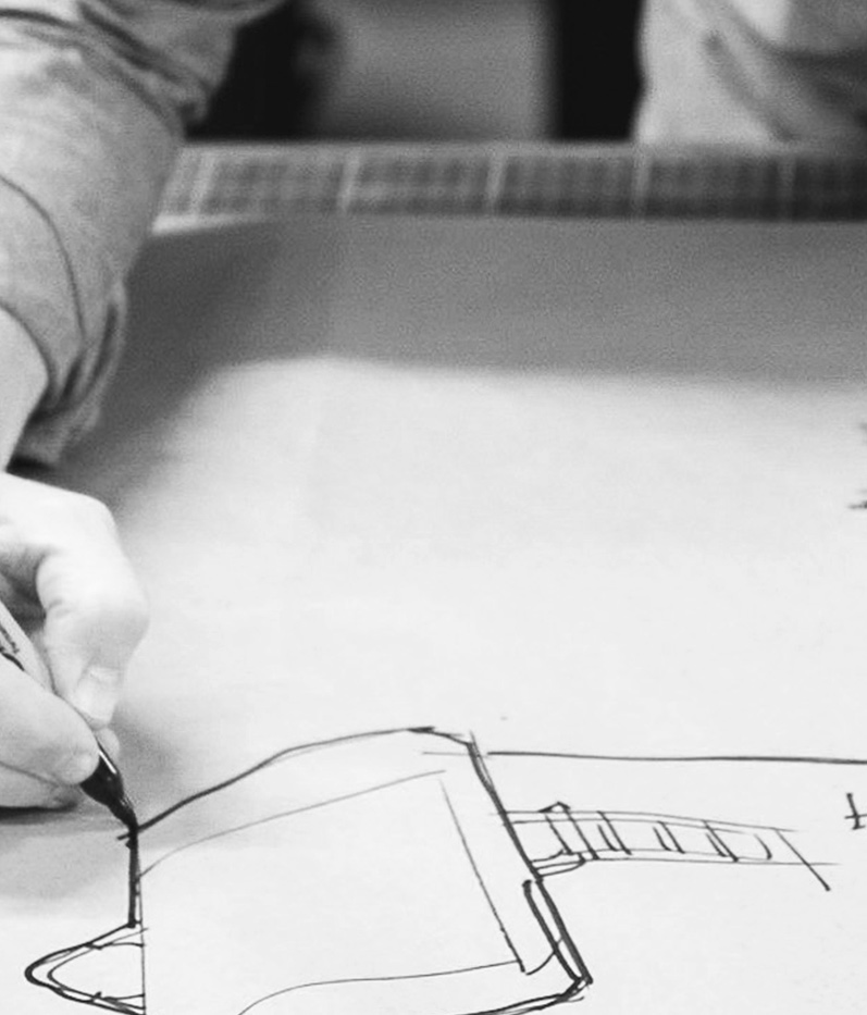
As you may have noticed already, we tend to think about things. Harrrrrd. We go high, and then we go low. We start broad, and then we home right on in. Our design process is no different. In fact, it might well be where the whole practice started. You have often asked us how we design our products, and where our ideas come from. Read on to find out. (Hint: it goes way beyond the actual product you hold in your hands. So, buckle up!)
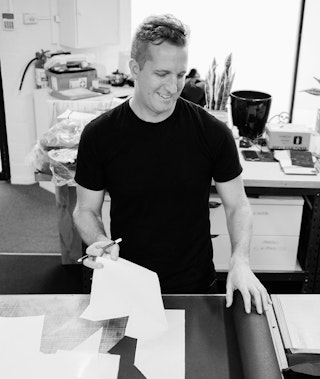
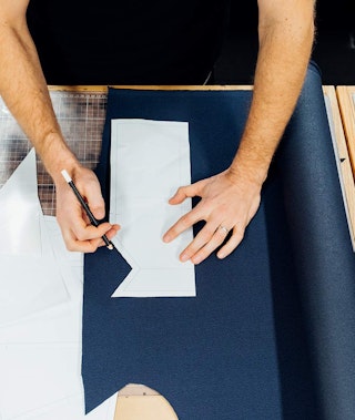
Every physical object in the universe has a set of dimensions. Length, width, depth. But there’s a fourth dimension we believe is just as vital: time.
Time can contextualize a design, give it purpose and define how that product will live on in the hands of its owner. And, making products that can be used and loved for a long time is, we believe, the best thing we can do for the environment and, of course, our customers.
At Bellroy, we design products that can be pushed and shaped by the way you use them. We design with materials that have already had a useful life, up-cycling them for a new journey. We use leathers that will soften and patina according to your interactions.
We hope that the significant effort we put into this design approach will give you products that intertwine themselves with your life, becoming even better on day 1000 than they were on day one.
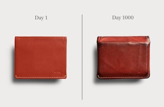
“Our environmental goals drive us to make products that are used and loved for as long as possible, because we see this as a key way to reduce our impact on the planet. But as we hope you also feel, there is more joy in products that we can use and love for longer. When a product resonates with us, we start to invest something of ourselves in it, integrating it into the ebb and flow of our everyday life, and cherishing the small moments of delight that a particularly good design can bring.” – Bellroy’s founding designer, Andy.
Before we put pencil to paper (so to speak), we do our research. We work to understand our customers as deeply as we understand ourselves. What do we have in common? Who do we want to be, that might be similar to who our customers strive to be, too? What pain points do we have, that others might as well? What do we want from the things we carry, that our customers would, also?
Once we’ve mapped those out, we listen hard for more detailed insights. We scour product reviews, customer support enquiries, notes from product workshops and in-depth discussions from within the carry community. We seek evidence of things that would make your life better, easier, more vibrant and more fulfilling.
Whether it's reducing the bulge of an uncomfortable wallet, or giving you easy access to the things you need by your side every day... then we look for the details that will make an experience even better. Not just for the first moment you discover them. But for every time you use it, for at least a thousand days to come. That takes a lot more work. But the joy it provides makes everything worthwhile.
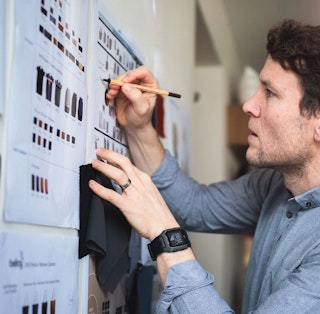
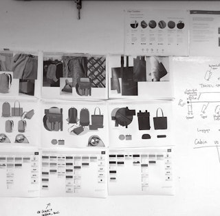
We sketch and draw (and mime a bit). We prototype in paper, card, leather and foam. We pattern and sew. We hack and experiment. We try different combinations until we find the best way to get all the elements working together. If something’s not quite right, we’ll go again. However many times it takes.
Core to the process, though, are still the questions – what is the need we’re solving, how can we make it better, and how will it live on through time? Read on to see how this played out in a few of our favorite designs.
Wallets were bulky and inefficient, their design and construction unchanged in generations. There was a fundamental tension – with every card, came a layer of leather to separate it. So to slim it down, we stripped out the excess layers of leather, kept most-used cards up front and stored the rest in one stack – no leather layers to bulk it out. At the time, this concept was unheard of.

We then set about finding a solution for getting to that stack of cards easily. We tried linings, thin cord, and a pull-tab. The pull-tab was a clear favorite – smooth, innate, and flat when the wallet was closed. The first generation of our pull-tab used thin webbing to keep bulk down, with just a small fold of leather at the end to grab. As the design of the Slim Sleeve evolved, we increased our ambitions, wanting to eliminate the lining and any superfluous materials that weren't fundamental to its use. We challenged ourselves to build a Slim Sleeve from nothing but leather and thread. And we did. The construction of today’s Slim Sleeve is the result of a decade of experimentation. The quick-access card slot features a very sophisticated origami fold that can locate the end of the pull tab without it snagging the cards. That origami fold took months to perfect. And the beauty of it is that no one would ever know it’s there.
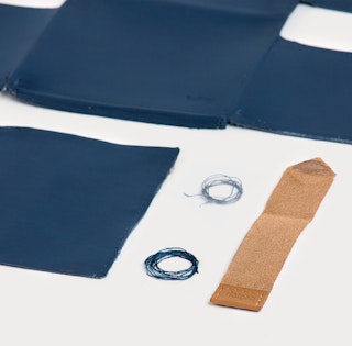
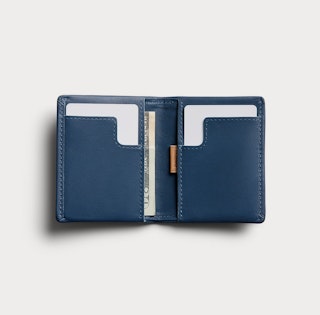
In its sixth major iteration, we applied our learnings and insights and applied them to our most experimental version yet: the Apex Slim Sleeve . We removed the seams from the already minimalist construction in favor of heat-bonded panels that sit meticulously flat, connected by a magnetic closure. And we introduced pre-molded edges that form around your cards from the moment you first slide them in. No breaking-in process, no stressed leather, no creases or bumps.
It’s an evolution that encourages our customers to evolve what and how they carry, too.
Check out the Slim Sleeve >
The format of a weekender bag represents casual, unstructured travel. The kind where you can throw your things in the back of the car and take off at a moment’s notice, if the mood strikes. The kind that embraces the open road, with no schedule. But ‘unstructured’ isn’t really our thing when it comes to design, so we had to marry this romantic ideal, with reality.
Our challenge here was to find a solution that honored the free-spirited kind of weekend travel, while doing a better job of access and organization than the weekender format generally provides – not having to wrap your laptop in your clothes for protection would be a good start!
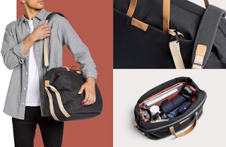
Our initial sketches looked at adding handles pretty much everywhere, to let users manipulate the bag as they wanted. We looked at expansion, and we reached for crazy fold out flap panels. We had some extravagant solutions coming together, until we realised that in doing so we were breaking one of the key features of the bag: its simple silhouette.
So we pivoted. We made the expansion subtle – and designed the carry handles to sit on top and compress the volume so they don’t look as big as they are. We moved the shoulder straps inwards to let them carry a lighter load more easily. We made the front pocket expand outwards, so it could be used even when the main compartment was packed tight. We placed a laptop sleeve inside the front pocket, so you could carry it over your shoulder and not have your laptop pushing into your hip. We designed the main opening to really open – it has been patterned to fully fold over so you can pack it easily or live out of the bag at destination. We hid grab handles in the end zip details and we added a loop handle on the back of the bag too. We organized the inside with pop pockets, zips and mesh.
With this design, we managed to hide organization in a silhouette that still says ‘I’m on a break’. Carefree and casual. We were able to traverse the work-into-weekend moment, and embrace the joy of a long weekend with a nod to the flexibility we need these days to merge in some technology and work.
We looked at the popularity of our Sling and realised it was great to offer a small carry option for day-to-day, when you don’t need to carry a laptop. But carrying a sling is still like carrying a bag. So we started thinking about the use of pockets, especially those extra ones on cargo pants. We played around with the idea of a ‘portable pocket’ that could hold everything close, even when you swap pants – but more accessible and organized than a pocket.
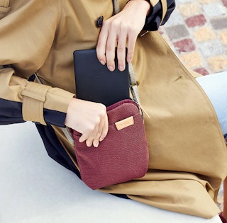

This ‘portable pocket’ thought experiment helped us define and establish the size and shape of the City Pouch and also one of the goals: to be as easy to carry as the clothes you’re wearing.
The bulk of our design energy went into making a pocket of that size accessible and organized. The zip access was designed to allow one side of the pouch to open right up, so you can see your contents. The compartment is divided to help separate your items and we added additional pockets on the front and back to allow for quick storage. We looked at the design and asked ourselves: Where would you quickly stash a receipt, bus pass or face mask? And how could we make it so that there was deep storage for some items you don’t need regular, quick access to, but the rest was right there at your hand?
Our essential carry items have grown through 2020. There are more ‘daily essentials’ we need to remember, but for many of us, we feel that our mental spaces were pretty full already. We designed the City Pouch to ease that mental checklist. That pre-packed ready-to-go preparedness might have seemed excessive in 2019, but it fits so well into 2020 and beyond. While we originally thought of the City Pouch as a travel and weekend companion piece, as the world shifted, it has become more vital and more capable than we first imagined.
Check out the City Pouch >
We aren’t a super formal crew, but at the same time we don’t want to turn up to work looking like we’ve just been on a hike. We like feeling organized, without looking ‘techy’. And we have lifestyles that move between cycling, public transport, gyms and home. We can see this is the same for many of our customers, too.
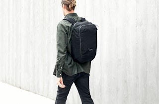
The Transit range of bags are our strongest packs in terms of ‘function’. They are packed (pardon the pun) with organizational features. And the Transit Workpack is the latest addition to this family, aiming to pull the best features of these bags into a tighter, slimmer form. We have tapered the shape and built it around personal presentation. We removed the sternum straps so there are no ‘distractions’, instead adjusting the shape of the shoulder straps and working on the padding to make sure they sit flat and cleanly over the shoulder. We even tweaked the shape to fit better as a single-shoulder ‘stand and chat’ style, without too much swinging or dangling.
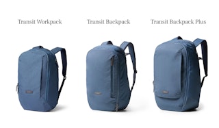
We designed zoning into the Transit Workpack . Work stuff is fully accessible via one back zip. It has a generous pocket, big enough for a mouse, cables or organizer to fit inside, and it also gives you access to your laptop. And, because the rest of your gear is contained in the main ‘zone’, there’s no chance of your gym gear or otherwise spilling out when you reach for your laptop in a meeting.
With the Transit Workpack , we really wanted to make a companion piece that reduced friction between home and work. Because, if we can service the time during, before and after your work day, we’re giving the bag a good chance to be used – well, often, and for a long time. And that’s our goal.
Check out the Transit Workpack >
As you can see, decisions made in the design of our products may not always be obvious. Sometimes, we don’t even know how to put them into words. But we make them, so that our products are eminently usable. And enduring in the hands of their owners. We are grateful to our customers for trusting our decisions, and knowing that the best of any Bellroy products is usually discovered in time.
“There’s been billions of marketing dollars spent telling us that ‘new is best’. And it’s in so many brands’ interests to say that the first day you get something will be the best it will ever be. But if you stop and think about the things you love most, that love has been built over time. You grow together with a person in a relationship. You work that denim jean in until it resembles your body and shape and is comfortable in all the right spots… That pair of jeans, or aged leather wallet, tell your stories. Find things that you will fall more and more in love with over time.” – Andy
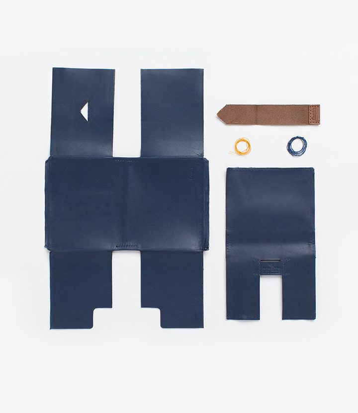
'Simple' isn't very simple at all. Here, we look at the simplicity in product design that comes from solving complexity.
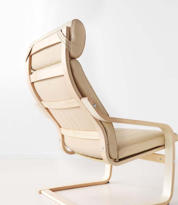
IKEA understands that design can be a great equalizer. Read more about what we take from this philosophy.
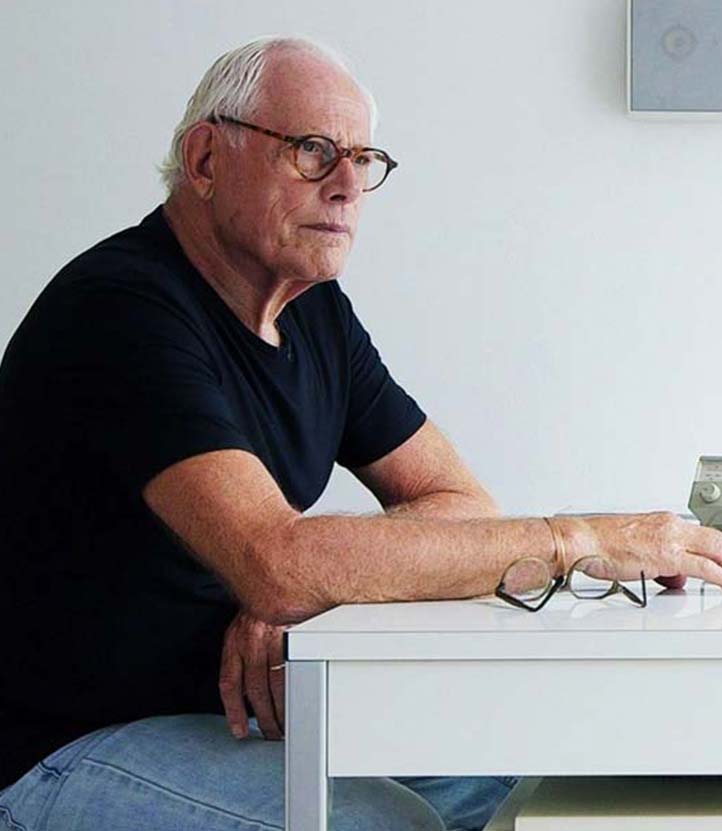
More than half a century after pre-eminent minimalist, Rams, started designing, his influence is still felt profoundly.